Home Tour :: Townhouse Living and Dining Room
This post contains affiliate links for your convenience which means if you purchase something I recommend I may receive a commission at no additional cost to you.
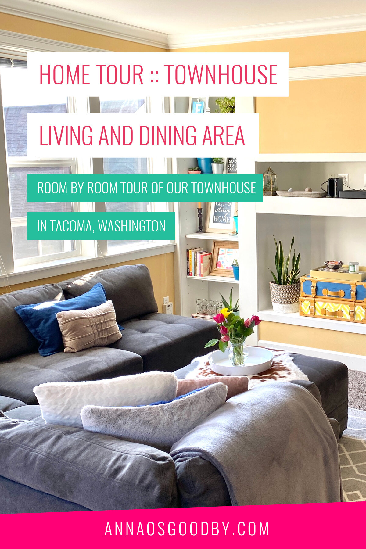
Welcome to our living and dining room! Something I absolutely love about our townhouse is that it gets such great light! Add in the yellow paint that’s throughout most of our house and it always has bright and cheery vibes. Which is definitely nice during our gloomy PNW winters too! Another thing that is really awesome about the space is all of the built-in shelving! I definitely didn’t waste any time filling those puppies up.
Couch: Similar | Cowhide: Similar | Pom Pom Throw Blanket: Similar | Tray: Similar
Our living/dining area is located on the main floor (which is kind of the second floor) and something else I really liked about the townhouse is it didn’t have a huge dining area. I know that’s not a popular opinion and maybe my thoughts on this will change. For me though, having a full separate dining room is such a waste of space… We really wouldn’t use one, so I love that we have an area that is functional but doesn’t take away from the use of the room. We also have a balcony right off of the dining area which gives us another little area where we can eat or hang out.
When it comes to our shelves, let’s be honest, they’re mostly used for my plant babies 😂🌱. They’re certainly the stars of the room with my sun-loving plants on the shelf nearest to the window and the ones that need less direct light on the other. Definitely serving out that purpose well!
For the rest of the space, I wanted them to be both functional plus highlight things that were personal to us. We do spend a lot of time in this space after all! So you’ll find that reflected through the artwork, different family heirlooms, and some of the rocks we’ve picked up from our adventures (yes we do that) that are on display. Designing each shelf was really all about purpose, meaning and a dash of styling.
Also, I’d like to let it be known that when I designed the “Let’s Stay Home” print for Evan’s first apartment… I did not anticipate the pandemic of 2020! It definitely has a different meaning these days.
Rug: Similar | Plant Basket: Similar | Decorative Suitcases: Similar
The other end of our living room, connects to our kitchen which is super handy! It’s really nice to be able to still chat while one of us is cooking and also being able to watch the TV if something is on. Plus being able to hand things through the opening if very practical.
When it came to the TV, the big opening where the plant and suitcases are was actually where the TV was intended to be. Our house was built in 2003, back in the era where the TVs were so deep! We decided against putting it there though and went with mounting it instead. It just worked out better and made more sense for us.
Light Fixture: Home Depot | Bar Table: Amazon | Bar Cart: Target | Bar Stools: Target | Shelves: Ikea
Now onto the dining room area! Like I said, this space isn’t too big but it works out perfectly for us. We had this bar table from our old apartment and decided to stick with it here too. When it comes to the dining area, my favorite part is the new lighting fixture for sure.
The one that was there when we moved in was a lot bigger and a little dated. I mean, it worked and everything, but since we opted not to have an actual dining table it ended up just looking too big for the space. Plus, with everything being very move-in ready it was really the only thing I kind of wanted to change. Queue me starting to look for light fixtures… My goal was to find something that was smaller, was a little more industrial, and wasn’t a million dollars. It took me a hot minute to find something I was into but this one ended up being perfect + it was only $150! Which, if you’ve looked at lighting before you know that’s a steal for those types of lighting fixtures.
On top of the bar cart, is my tried and true open shelving for some of my favorite glasses. I’ve integrated this design element into pretty much all of the apartments I’ve lived in since my NYC days and it’s always one of my favorites. I also swear by these shelves from Ikea for doing this. They are SO much sturdier than others I’ve tried. Another thing you can do is spray paint the hardware so you can put a little of your own touch on the look too.
Spray paint is my friend let me tell you! Another thing I spray painted was the barstools! I had a set of two but since we put the table in the middle of the room we needed another set. Of course, after buying a house I was trying to save wherever I could and didn’t want to spend the brand new price for another set. So instead, I looked on Facebook Marketplace, got a set of 3 for a whopping $25 and then I spray painted all 4 of them black so they all matched. My original two were a bronze metal color and the new ones were white, but the spray paints didn’t match perfectly so I just went black so they’d all match.
I’m a little biased but I think it turned out pretty good! Here’s a final look from the dining area peaking out onto the balcony. This is a fun little corner too because our hummingbird feeder is right outside and then they also like to sit in the trees right outside the window! They’ve officially become my unofficial pets now. Plus that tree has been moved into many rooms and was on a mission to die but has been thriving in this corner ever since so it’s staying there for the long-term! Oh to be a plant mom!
I hope you enjoyed the tour and I’ve linked to more of the products we used + some similar options below! if there’s anything specific you’re interested in though be sure to shoot me a note!


